Warm/ Cool: Which Color Palette is Trending for Interiors?
Once upon a time, people would take advice from interior-design magazines and TV shows. As times are evolving, the debate between warm and cool color palettes has reached far beyond simple aesthetics to being more focused on giving the house a homely look & feel. Read on today’s blog to find out how to achieve this in a strategic yet effortless manner.
While both color palettes remain relevant, the design world has seen a decisive shift toward warmth this year; even more so as we seek comfort and stability in an increasingly fast-paced world.
After years dominated by cool grays and stark whites, the trend has swung back to a palette that feels like a comforting hug:
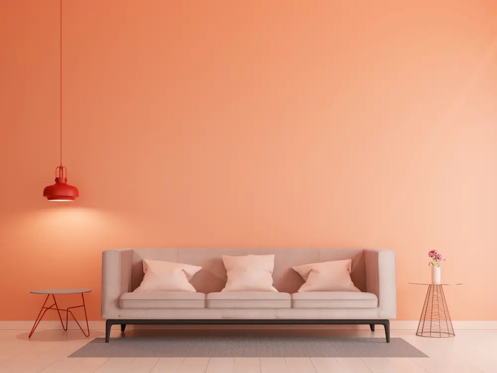
- Earth-Inspired Comfort: The most prominent trend for 2025 is the return of rich, browns and soft terracottas. Pantone’s 2025 Color of the Year, Mocha Mousse, epitomizes this—a soft, “cocooning” brown that offers warmth, shelter and a sense of everyday indulgence.
- Optimistic Yellows: Vibrant, “happy” shades like Dulux’s True Joy (a sun-drenched yellow) are being used to fill homes with much-needed optimism and energy.
- Moody Elegance: Darker warm tones, such as deep burgundy and oxblood, are quickly becoming the go-to for sophisticated, intimate spaces like dining rooms and libraries.
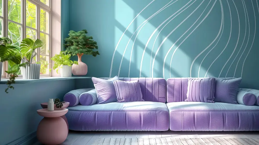
Cool tones have evolved into “restorative neutrals” designed to provide mental clarity.
- Biophilic Greens: Soft sage and deep olive greens continue to be popular as they seem to help lower stress and mentally connect us to nature.
- Tech-Inspired Serenity: “Digital Lavender” and airy sky blues are trending in bedrooms and home offices.
It is now being suggested that we should choose the color of a space based on the emotional purpose it will serve. For example:
- For Connection & Energy (Living Rooms, Kitchens): Lean into the Warm Use honeyed neutrals, caramel tones, or mustard yellow to foster a welcoming atmosphere.
- For Focus & Restoration (Bedrooms, Offices): The Cool palette is the best choice here. Muted teals, soft lavenders, and greens help regulate the nervous system and promote deep, restorative sleep.
- The Bridge (Warm Neutrals): If you’re undecided, replace stark whites with “buttercream” or soft beige. These warm-toned neutrals offer the airy brightness of white without the sterile coldness, making them the perfect timeless foundation for home or office space.
Ultimately, the latest trend in color palette for interiors is one that promises authenticity. Whether you prefer the energy of a sunbaked canyon or the calm of a forest clearing, the right color is the one that makes your space feel most welcoming, giving away its true purpose.